Sunday, August 31, 2008
Saturday, August 30, 2008
Fallout 3 booklet
This promotional booklet for Fallout 3 is fantastic. Don't know if its great advice for surviving in a post nuclear Armageddon world but great design/illustration/humor.


Thursday, August 28, 2008
Wednesday, August 27, 2008
Tuesday, August 26, 2008
Ralph Mastromonaco
Ralph is one of my classmates in RIT's New Media Design Program. Short of it is that he's awesome and will be a big name in the future. Here's some of his work.


Ralphs videos.


Ralphs videos.
Labels:
New Media,
quirky,
Ralph Mastromonaco,
RIT
Sunday, August 24, 2008
Daft Punk Dancing Girl
Here's a really nice YouTube video I stumbled upon. I thought this was a blast, the double timing gives it alot of fun and lets her move more like a cartoon than a girl. It's some excellent animation reference too and a good concept (dancing to slowed music then speeding it up in post). There's some great timing and some very nice poses in the first 30 seconds (love the first bit and how she comes out of it) but it kinda' drags on and doesn't really bring anything new.
A lot could be done with this concept. Anyway I thought it was cool live action and neat from a character animation perspective.
Saturday, August 23, 2008
Wednesday, August 13, 2008
Aged paper is great
Saturday, August 9, 2008
Friday, August 8, 2008
Wednesday, August 6, 2008
Mozilla's Next Gen Broser Concept
Aurora (Part 1) from Adaptive Path on Vimeo.
Aurora. Looks fancy. Don't know about the radial button for all functions.
Monday, August 4, 2008
Sunday, August 3, 2008
Some things I've learned at the library
Penguin books are always well designed. Including the Pelican series.

In the 60s.
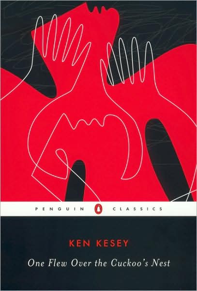
And today.
Chuck Palahniuk books tend to be well designed.
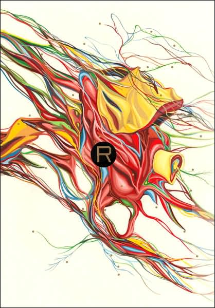
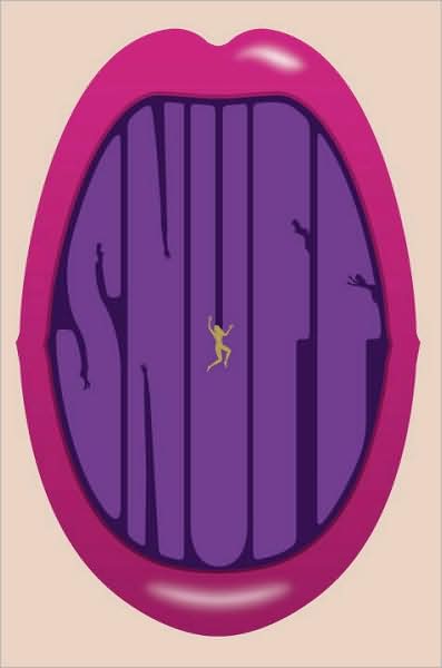
Such awesome book design. Can't find any images of the back or spine which are just as cool. If you can't see, the negative space of the letters is naked chicks. My kinda' design.
Michael Chabon's books are also frequently well designed


In the 60s.

And today.
Chuck Palahniuk books tend to be well designed.


Such awesome book design. Can't find any images of the back or spine which are just as cool. If you can't see, the negative space of the letters is naked chicks. My kinda' design.
Michael Chabon's books are also frequently well designed

Subscribe to:
Comments (Atom)


