Thursday, July 31, 2008

levelHead


This is so cool. An interactive puzzle where you navigate a man through a series of rooms by tilting a card board box. Design wise its also really well done too.

Wednesday, July 30, 2008

Penn and Teller Bullshit! Season 5 Intro


The intro for Penn and Teller's Bullshit (a great show) is pretty nice and a big improvement from their previous intros. Worth a look.

Sunday, July 27, 2008

Nice book covers from the library

Worked at the library today, grabbed a couple books with nice covers. Really you'd think that good designs wouldn't be in short supply nowadays but honestly most of the stuff out there is pretty terrible. Generic cut and paste template assembly line crap. These are just a couple of the ones that caught my eye today.

(Oh ignore the stickers. Can't find good pictures online of the covers.)


Friday, July 25, 2008

Kafka by Crumb


Here's an excellent book my dad picked up last November. Kafka, illustrated by R. Crumb and written by Zane Mairowitz, is a biography/tale about Kafka. The writing is great, superbly weaving between fiction and non-fiction, sticking Kafka in his own stories then pulling back for a bit. The real star of this novel, however, is the work of Crumb and the general book design.

Crumb shares many of the demons that Kafka was known to possess and this is clearly evident in the work. Crumbs illustrations are pulsing with neurotic energy, with an outsiders fire. I love his work, and respect his line work immensely.

The book is also very well laid out. The cover and back are both unique and communicative of Kafka. The page design weaves graphic novel conventions with text in very interesting ways.

I highly recommend picking it up or heck, I'll lend it to ya'.


What a great first page.


Tuesday, July 22, 2008

Library of Congress


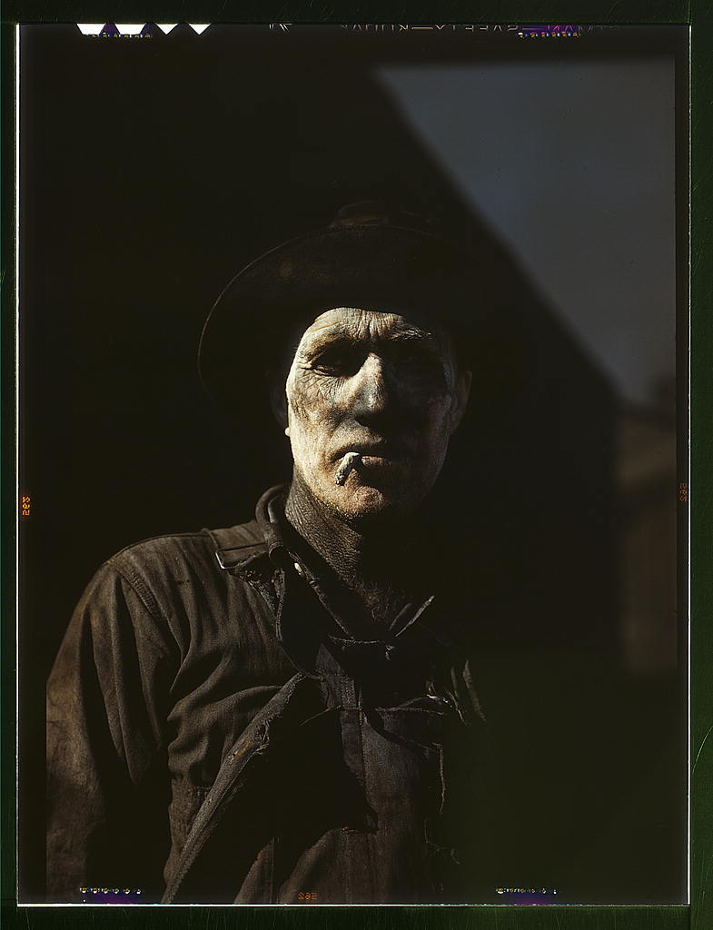
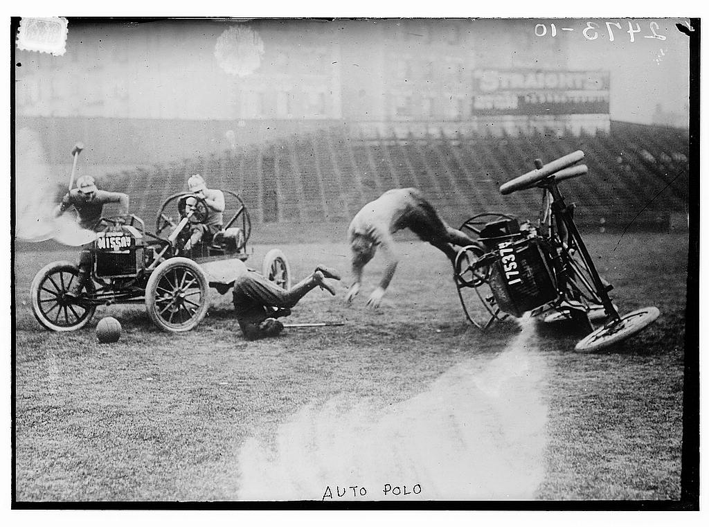
The Library of Congress has a flickr account! Thousands of free public domain images ftw! Amazing stuff. Great reference and great for web use. They only catch is that for now they've only got 1930-40s New Deal type stuff and 1910s news shots. Hopefully they'll add more.


Auto polo? YES PLEASE!

Vernacular Typography

Amazing collection of Polaroids of hand painted signs.


credit goes to typeneu.com for finding this.

Sunday, July 20, 2008

Nosferatu

So I just watched Nosferatu and wow, what an amazing movie. Genuinely creepy and horrifying today, it is also aesthetically a beautiful movie. The tinted colors, the iris shots, the warm flickering of the image, it all comes together to give this movie real soul.


Great shot looking out a window to the house that the unwitting protagonist will sell
to Count Orlok (Nosferatu). Creepy and sets up later conflict.


Hutter meets Count Orlok. Notice the halo formed by the arch around Hutter while
Orlok is framed by complete black.


Count Orlok visits Hutter by telekinetically opening the door. Wonderfully creepy
lighting and acting. Notice how the door frames him like a coffin. The iris in gives this
a nightmarish feel and further demonstrates Nosferatu's power.


More creepy coffin framing on Orlok.


"Oh, two mosquito bites." No Hutter, no.


Nosferatu emerges from his coffin in the cargo hold after driving the crew mad/killing
them with plague to finish off the captain. The extreme angle shot against the rigging
of the "deathship" serves to illustrate Orloks power. Throughout his voyage to his new
home there are great tight shots of rigging and sails as they pass through the camera
view or the bow as it rises and falls.


Hutters wife Ellen is drawn by the approaching Orlok. The composition here is so
fantastic. The inclusion of the crosses (I don't even know what they're for) leads the
eye through the shot and gives it a nice visual pattern. They also contrast the unholy
power of Nosferatu and almost imply a cemetery.


I love this shot. The color, the pattern of the bricks, the shadow, the iris, all of it.
Right now this drummer is heralding the coming of the plague to the citizens as they
look down at him from their windows.


Supernatural power afoot.


I wonder what direction on this shot was like? Also, I want a mustache like that.


More crazy Germans.


That's what she said.

But seriously, this is a must watch movie. So scary, so beautiful. There's a ton more to see too, I've only put up half of my favorites.